/* */

Wednesday 28 April 2010

Usb man - Precision Curve Placement


 I've re-approached the curve modeling workflow to achieve greater accuracy on the horizontal reference curve placement. In the previous example I just eyed them up which caused one or two problems in terms of fall-off when it came to building patches (there was a slight visible ridge around the ear section. 

For this example I have started off with a simple nurbs curve with 8 patches on the horizontal and 1 on the verticle. I then began to shape it out roughly to follow the contors of the reference image. At this stage the vertical lines in the mesh are irrelevant because I will be constructing my own. 

By adding horizontal isoparms, I can get closer to the final shape, the beauty of this technique is the curve will maintain continuity as I edit them - a huge advantage over polygonal modeling where each vertex has to be adjusted by hand. 

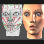
The two dots represent key areas in the mesh - the top one is where hat meets head which will ultimately be extracted so it can be lifted, and the second is where the head meets body and takes quite a dramatic change of direction. I may wish to add some sort of indentation here to form a ridge. As you will see the top of the model remains open at this point, the curves interpolation when I reconstruct the mesh will take care of this and achieve a perfectly rounded mesh.

   
 Now the horizontal isoparms are in the correct position to depict the surface I add the apperture that will facilitate the ear. At this point I will concentrate on the body shape and come back to it - the geometry is ready for a sperical shape to be attached to it because I have maintained it's eliptical properties. 
Once the isoparms are lined up and have allowed me sufficient geometry at key points I begin dividing the half loops into sufficient edit points to accomodate the ear (eight in total). 

Now its simply a case of joining the dots up working from the bottom up and stopping at the ear (I want to break tangency here to create an edge where ear meets hat).

 Previously I have used the Bi-rail tool to output nurbs patches that can then be converted into polygons with an arbitrated face count. In this example I have bypassed the nurbs patches and simply output the bi-rail as a polygon. Once all the poly faces had been created I checked and reversed the wrong facing normals and merged the vertices together (using a tolerance of 0.1). I then ran the Soften Edge  to smoothen the mesh out.

As it stands the mesh consists of 480 faces which is pretty low considering the smooth interpolation between the shapes. This technique is pretty standard - imagine the ear apperture is for a leg or arm, no problem the geometry is there to continue. The key area that allows the geometry to do this is the five sided join, this is where nurbs surface falls down because you cannot attach 5 patches together without performing a global stitch, which can be intensive on the computer and a bit unpredictable.    
left - Very important the normals are facing the correct way in order to achieve a smoothmesh when the vertices are bound together. Once they are facing correctly and merged together the normals can be smoothed to disguise the faceting furthermore. 

Tuesday 27 April 2010

Polygone Conversion

Once the five edges have been attached together they can be converted to polygon using the Modify - conver Nurbs to Polygone. I kept the setting on Quads and changed the conversion to "per span # isoparms". This is the best way to convert the Nurbs because you have control over each patch the intensity of the output polygonal mesh. Very useful in this instance because the character requires a lot of geometry around the ears, but not as much around the bottom side of the hat. By changing the number of spans I can reduce the amount of edges the character will have - very useful for game design.


Close up of the mesh, here with the global stitch areas pointed out. Once the mesh was converted the vertices were merged to stitch the different poly planes together. Because the global stitch did such a good job achieving tangency, this was a simple operation that was achieved by selecting all the vertices and merging them with a tolerance of 0.1.

Nurbs Mesh

Here is the output mesh of a nurbs model I made whilst experimenting with this technique. I built the curve network as described earlier and Bi-railed them to create the surface. In this example there are five patches joined up - a big no-no for nurbs modeling. Nurbs patches have to consist of four sides and cannot join five edges together. The way to overcome this is to perform a global stitch to bring the edges together and importantly remain tangent and smooth.

Each patch 1 through 5 were separated from each other and then systematically attached, survace rebuilt to resore parameterisation and then the history deleted. Attaching the patches creates tangency between the two but can pull it further from the opposite neighbouring patch. Next task is to detach the patch so it can be joind on the other side (deleting history inbetween). I have created two MEL buttons that will perform the attach functions with one click and the detach functions with one click - speeding up the workflow.

Once the patches have been attached/detached twice (moving in a clockwise direction) they can have the global stitch applied. As you can see from above the stitch has pulled the edges together perfectly and will convert to polygone with little issue.

Bi-Rail

Filling in the geometry

Now the mesh has been created and divided into single sections I have used the Biral tool build the output nurbs geometry. At this point each patch is separate, but because created using a constant flowing shell that has tangency with its surrounding patches no seams will be visable and the model will appear to be one smooth surface.

Curve Structure

WireMesh

Started by constructing a mesh from nurbs curves that follow the profile of the models shape. Once the horizontal curves have been positioned, they can be connected vertically using an EP curve. In order to add extra edgeloops I have cut each curve where they intersect. Now if I want to add an extra edgeloop inbetween two existing loops I can rebuild the curve and enter the desired amount of spans to be input this divides the curve, and automatically inserts a knot in the optimum position to maintain tangency.


From above I can look down the wire model and adjust the vertices and edit points to achieve a nice falloff between contours. At this stage I still have a lot of control over how the mesh will finally appear and can really work at achieving a nice and smooth interpolation. Once I am happy with the positioning of the horizontal contours I can begin connecting with the EP curve tool holding down "V" key to snap to the edit points. The curve will appear with tangency automatically maintained so the curves are smooth and contigeous - perfect for what I am after.    

Geometry - USB Man

Creation of USB Man.

Front

Original Reference drawing for the USB man. First impression is if this object would be mass produced and machine made in order to achieve a smooth interpolation between interconnecting areas like where the ears and the top of the head meet, the feet and the arms.

Also would like to re-address the goggles and the mouth area. at the moment looks a little stagnant - not real scope for animation, so what I intend to do is develop these area's into something interesting.


Side


Side View of the same character, showing the ear being attached to the head and toe profile, and also a dome shape that protrudes from the back acting as a handle to assist pulling his head off.


Head Off


Character with hat lifted to reveal the usb part. Model would require some sort of ridge around the bottom part to secure his hat when it's in position.

Thursday 22 April 2010

Re-evaluating tall character


Dean: i have taken the feedback received by Jim and re-visited the character i previously created,
i have changed the expression of the character to make him more sad and tired.

Character features are:
-Sunken dark eyes
-Bags under eyes
-Small mole like marks on body
-Small lines (like what you see on leather) on body
-No teeth just gums
-Bottom lip is always out


The arms of the character are tenticle like with suction pads at the top, with a sticky under neath texture and little bumps, the arm will be a smooth rubber texture. Where the arm comes out of the body is a plug also a smooth rubber texture.


The arms are long enough to reach the top of the rug so they can be cleaned, the sticky texture collects all the dust particles and dirt the rug as been gathering.


The legs of the character are kangaroo like to enable him to have the right spring movement just before stretching out and shooting himself off. They are strong and a smooth texture like the arms.


The stance of the character is tired, dragging arms slowing bouncing while he walks, droopy facial expression and that bottom lip sticking out.


Front view of the character.


Friday 16 April 2010

Mesh/Texturing Tutorial

Useful couple of tutorials from Character designer Jonathan Rush. First one is about creating textures using photoshop. The second is about creating decent geometry to achieve good deformation in your character mesh.

Jonathan Rush

Saw this advert in a CG Society newsletter, for a character design workshop. This is a link to Jonathan Rush (the workshop tutor) website - a useful resource with tutorials, examples of work and further weblinks to more character designers.

Thursday 15 April 2010

Body Types

Body shape classification system is known as "somatotyping". The body can be chategorised into three main types:
  1. Mesomorph
  2. Ectomorph
  3. Endomorph

Mesomorphed Character

  • Heavy Boned
  • Compact, robust, square body
  • Well developed muscles
Traditionally associated with the hero, with robust, compact muscular body that has strength and agility. In fantasy art a fit and muscular body is associated with a good male protagonist. The antagonist usually has physical defects.


Ectomorphed


  • Fragile- seeming features
  • Minimal flesh and muscles

Light and slender, usually female, nymphs, vampires aged wizards - associated with magical powers. Female Ectomorphs rely on agility in physical combat and slenderness in a female is regarded as a desirable quality. Wizards have a more emaciated appearance to promote the illusion of age and to increase the dramatic effect when they unleash their powers. Skeletal knowledge is crucial here as bones are often visible through the skin. Hands, feet, back and rib cage are usually the areas thatstick out the most. 


Endomorphed


  • Softly rounded shape
  • Large belly
  • Small hands
  • Fleshy overall appearance

 Hefty rounded build, tendency to be fat. Commonly appear as secondary characters - usually on the side of evil in roles where the novelty of their size is fundamental. Shape is dictated by fat distribution which varies during movement. Fat is not anchored to the body and can move around freely - this should be reflected in the way it deforms.


MEL Wiki

Web resources I have found that provide information about MEL commands.

Autodesk - Trusty ol'faithful
Wiki - Pertinent questions down the right, put in laymans terms so I can understand it
caad
Twiki
Tiddlyspot - Visual guide of UI Controls, commands included.
Learning Maya - More than just a MEL resource
Cg Sutra - Useful introductory tutorials on using MEL

I Draw Girls.Com

Found this extensive blog that has loads of tips on drawing and character design. Could really spend hours trawling through this as there's so much to go on, including a pretty impressive portfolio of the artists work.

Haloweeners - Neil McFarland


Came across this illustrator whilst looking at a computer arts article. The posture and body language of both characters (especially the one on the left) depicts a primitive, neolithic stature and there's a definite air of sadness in the two. The left hand characters drooping eyes reinfrc this. This is exactly the mood I want to create in my principal character and will help direct my drawings which could perhaps be exaggerated by a havy shell weighing the character down.

Character Design Tips - Jon Burgerman

Extract taken from Computer Arts magazine, featuring 20 tips from illustrator Jon Burgerman (who has adopted a very distinc style hat can be seen in various brand identities, notably the murial he did for Size in London)

20 character design tips


Lacking character? Jon Burgerman drums up 20 tips for creating fantastic characters and the best ways to bring them to life

Character design can be a tricky beast to tackle, because although many of the classic characters familiar to us all through cartoons, entertainment and advertising look simple, that simplicity usually belies the many hours of work that have gone into their development.

From Mickey Mouse’s famous three-fingered hands – drawn to save production time when the character was first developed for animations in the 1920s – to the elegant simplicity of Homer Simpson, character design has always been about keeping it simple. But aside from clean lines and easily readable features, what else are you going to need to know? There’s knowing what to exaggerate and what to play down, what to add to give a hint of background and depth, and what to do to develop personality. Getting started can be the trickiest part in any character development project, but once you’ve got some ideas these tips will help you breath life into your creation…


1: Research and evaluate
It can be helpful to try and deconstruct why certain characters and their characteristics work and why some don’t. There’s no shortage of research material to be found, with illustrated characters appearing everywhere: on TV commercials, cereal boxes, shop signs, stickers on fruit, animations on mobile phones, and more. Study these characters and think about what makes some successful and what in particular you like about them.


2: Design and plan
Where will the character be seen and in what medium? This will have a direct bearing on how you go about your design. For example, if the character is for a mobile-phone screen, there’s no point designing it to have a lot of intricate details and features. Nathan Jurevicius says, regardless of the format, “The process of thinking up concepts always starts the same: paper, pencil, green tea... lots of thumbnails, written ideas, scratches and sketches over sketches.”


3: Who is it aimed at?
Think about your audience. Characters aimed at young children, for example, are typically designed around basic shapes and bright colours. If you’re working for a client, the character’s target audience is usually predetermined, as Nathan Jurevicius explains: “Commissioned characters are usually more restrictive but no less creative. Clients have specific needs but also want me to do my ‘thing’. Usually, I’ll break down the core features and personality. For example, if the eyes are important then I’ll focus the whole design around the face, making this the key feature that stands out.”


4: Visual impact
Whether you’re creating a monkey, robot or monster, you can guarantee there are going to be a hundred other similar creations out there. Your character needs to be strong and interesting in a visual sense to get people’s attention. When devising The Simpsons, Matt Groening knew he had to offer the viewers something different. He reckoned that when viewers were flicking through TV channels and came across the show, the characters’ unusually bright yellow skin colour would grab their attention.


5: Line qualities and styles
The drawn lines of which your character is composed can go some way to describing it. Thick, even, soft and round lines may suggest an approachable, cute character, whereas sharp, scratchy and uneven lines might point to an uneasy and erratic character. Sune Ehlers characters are bold and seem to dance on the page, which echoes his approach to drawing them. He explains: “Drawing a doodle is about decisive pen-manoeuvring. A strong line for me comes from strength and rhythm.”


6: Exaggerated characteristics
Exaggerating the defining features of your character will help it appear larger than life. Exaggerated features will also help viewers to identif y the character’s key qualities. Exaggeration is key in cartoon caricatures and helps emphasise certain personality traits. If your character is strong, don’t just give it normal-sized bulging arms, soup them up so that they’re five times as big as they should be!


7: Colour me bad
Colours can help communicate a character’s personality. Typically, dark colours such as black, purples and greys depict baddies with malevolent intentions. Light colours such as white, blues, pinks and yellows express innocence, good and purity. Comic-book reds, yellows and blues might go some way to giving hero qualities to a character.


8: Adding accessories
Props and clothing can help to emphasise character traits and their background. For example, scruffy clothes can be used for poor characters, and lots of diamonds and bling for tasteless rich ones. Accessories can also be more literal extensions of your character’s personality, such as a parrot on a pirate’s shoulder or a maggot in a ghoul’s skull.


9: The third dimension
Depending on what you have planned for your character, you might need to work out what it will look like from all angles. A seemingly flat character can take on a whole new persona when seen from the side if, for example, it has a massive beer belly. If your character is going to exist within a 3D world, as an animation or even as a toy, working out its height, weight and physical shape is all important.


10: Conveying personality
Interesting looks alone do not necessarily make for a good character; its personality is key as well. A character’s personality can be revealed through comic strips and animations, where we see how it reacts to certain situations. The personality of your character doesn’t have to be particularly agreeable, but it does need to be interesting (unless your characters is purposely dull). Personality can also be expressed simply in how the character has been drawn.


11: Express yourself
Expressions showing a character’s range of emotions and depicting its ups and downs will further flesh out your character. Depending on its personality, a figure’s emotions might be muted and wry or explosive and wildly exaggerated. Classic examples of this can be found in the work of the legendary Tex Avery: the eyes of his Wild Wolf character often pop out of its head when it’s excited. Another example of how expressions communicate motions is deadpan Droopy, who barely registers any sort of emotion at all.


12: Goals and dreams
The driving force behind a character’s personality is what it wants to achieve. This missing ‘something’ – be it riches, a girlfriend or solving a mystery – can help to create the dramatic thrust behind the stories and adventures your character gets up to. Often the incompleteness or flaws in a character are what make it interesting.


13: Building back stories
If you’re planning for your character to exist within comics and animations then developing its back story is important. Where it comes from, how it came to exist and any life-changing events it has experienced are going to help back up the solidity of, and subsequent belief in, your character. Sometimes the telling of a character’s back story can be more interesting than the character’s present adventures… or not, in the case of the Star Wars prequels.


14: Quick on the draw
Don’t be afraid to experiment and ignore all the rules and tips about planning and crafting the look of your character. Going against what is supposed to be the right way of doing something could create unexpected and exciting results. When artist Yuck creates his characters he doesn’t really know what he’ll draw. “I just listen to music and draw the result dependent on my mood: freaky or cute. I always want to have a drawing that I find interesting. I then work more on the character after it’s okay with me and my brain,” he says.


15: Hone, plan and polish
Instead of just drawing or doodling without too much pre-planning, Nathan Jurevicius prefers to take a different approach. “I take a long time creating finished looking roughs and also thinking about how the character could be expanded beyond a 2D artwork, what the character will do in a specific world, and how it speaks and acts,” he says.


16: Drawn in mud
Having decent materials to work with is useful, but not essential, for the early planning of your character. A lot of amazing characters were successfully designed years ago when no one had personal computers and Photoshop was just a dream. The drawings of your character should still work when rendered on paper with a simple pen or, as Sune Ehlers puts it, “The character should still be able to work with a stick dipped in mud and drawn on asphalt.”


17: Real-world drawing
Ian, of I Like Drawing, generates some of his characters away from both the computer and the sketchbook, allowing outside elements to influence his work. “I really like characters that interact with their surroundings,” he says. “The environment normally suggests an idea and then I let my strange mind do the rest. I prefer drawing in the real world with a pen instead of on the computer, because it feels good and odd things happen.”


18: Release the beast
Show people your creations and ask them what they think. Don’t just ask whether they like them or not. Instead, see if they can pick up the personalities and traits of your characters. Find who you think is the suitable or ideal audience for your work and get feedback specifically from them about it.


19: Beyond the character
In the same way that you create a history for your character, you need to create an environment for it to help further cement believability in your creation. The world in which the character lives and interacts should in some way make sense to who the character is and what it gets up to.


20: Fine-tuning a figure
Question each element of your creation, especially things such as its facial features. The slightest alteration can have a great effect on how your character is perceived. Illustrator Neil McFarland Neil McFarland advises: “Think about the meaning of the word ‘character’. You’re supposed to breath life into these things, make them appealing and give them the magic that will allow people to imagine what they’re like to meet and how they might move. I think it’s strange how creating characters for the sake of it has become a distinct branch of graphic design.”

Tuesday 13 April 2010

Arm Rig - Candy Wrapping

Arm Rig 1


Nice technique for maintaining volume when the arm is rotated in X (in this instance). Gives a smoother falloff between sections of the arm. The video below goes into greater deatail the procedure to create this arm rig.


Arm Rig 2

This video explains the technique to achieve the results featured in the above video. I have seen this a few times before, notably in Jason Schleifer's "Animator friendly rigging" series (well worth a watch!). The arm setup consists of two joint chains. The first is a simple chain that controls rotations, the second is the skinning chain which controls the falloff when the arm is twisted. To do this a multiply divide node is created and its input 1x is hooked up to the first joint chains twist rotation (in this occasion it's the Z axis). The value is then divided by 4 (or multiplied by 0.25 - same difference) and applied to the corresponding joints on the second chain. This is possibly how that nice falloff was achieved in the one eyed footballer rig that featured in  Edoardo Pili's impressive reel.

Monday 12 April 2010

Prospected Employers

The Frank Barton Company

email
prodduccion@the frankbartoncompany.com
infantas 32

address 
1º dcha
28004 madrid
spain
t +34 911 426 299


Spanish based company, specialising in VFX. Probably a logistical improbability to work for because of their location but really liked their showreel. First came across them when researching the usb character, they produced a vinyl toys advert that has its similarities in look and form.
Content here

Company List

The Visual Effects Company
4 Bourlet CloseLondon
W1W 7BJ
T: (0)20 7637 4832

E: info@thevfxco.co.uk

Friday 9 April 2010

Spiraloid

Flea type character
  Couple of images I found on the Spiraloid website (list of weblinks to the right) openingpageseems very pre occupied with the dark and the strange and is reflected in his imagery. 

Reason I put them up is because they remind me a lot of the microscopic images of dust mites i've found. I like the characters legs, look delicate and fragile under that large bulbous head but simoultaneously powerful and dynamic. From these angles it is difficult to tell exactly how it functions, whether it talks etc.


Character Rig Reel


Demo reel from a guy known as ArtOfJoelBeaudet on Youtube. Quite a simple rig, nice jiggle on the belly and face and some good features such as squash and stretch in the limbs and IK/FK switch. Set driven keys used to control the foot articulation (toetap, toelift, twist etc) and a bit of squash and stretch in the stomach.

Drunk Love


Another very short from the Joel Beaudet - this time the animation is hand drawn and gives great reference to the types of motion the character needs to achieve. Although its very it shows really nice drawing ability and the character pulls some some really nice exagerated poses.

"Al Dente" Art Work

Just a few character sheets taken from the "Al Dente" web site, detailing the character development process. Gives a good idea of the level of preparation necessary to produce a believable character.

Chef
Sketches for the chef character, who threatens to devour the little girl. Attention here is to facial expresions the character is capable of. The animation doesn't have any dialogue so it is paramount that ample communication is achieved through aesthetics. From this sheet we get a relly good impression of wha the proposed character is all about - despite the drawing styles varying from sketch to sketch they all present the common denominator of a snooty (nose turned up, eyes closed)  sinister (pencil like tash, emphasis on teeth) character.


Girl
Same again but of the little girl character - eye's have more of a broad manga look about them - countenance gives good insight in what part in the animation she will play. There is a flashslide show on the site and can be accessed through this link. Theres also some colour pre vis work which indicates look feel and mood of the film. Would have been nice to have a bit more regarding the technical side of the film but hey ho!

Thursday 8 April 2010

Character Reference

Bed Bugs


Anmation Festivals

List of relevant Animation Festivals from around the world.
Wikipedia
First result on a Google search yeilded this Wikipedia page that has a list the who's who of animation festivals around the world and provides lnks to their respespective website as well asa Wiki page on each one. I will go through the list and narrow them down to the ones most relevant to my field of study. Nice to see Bradford Animation Festival in there.


11 Second Club
Monthly animation competition, where kindred spirits are tasked with applying an accompanying animation to a usually notorious film soundtrack. Would be a great exercise in testing out my rigs (the only real way to test them) and illuminate any potential flaws it may have. 11 seconds is a nice time scale to work from.

Wednesday 7 April 2010

Animation Jobs

Showreels

List of impressive showreels I have come across, gives a good idea of the standards currently being set in the industry:


Character TD Reel 2010 from Chad Vernon on Vimeo.


Heavy use of C++ scripting to develop proprietory tools that aim to bolster performance and speed.  Lots of things to chew on and decipher.


Marek Schneider
Very accomplished showreel, not done in Maya - think it looks like Max?? (will look into it!) Begins with a lot of high end animation, then has a nice breakdown of the characters features. Loads of nice UI functions for controlling facial and deformation factors of the characters. Nice background music - Someone advised in the CG Society Forum to include some sort of voice over to explain some of the more technically intricate features, in case the interviewer isn't clued up on the rigging process.  Really like the functionality of the fish rigs. He's acquired a nice blend and control system between dynamics and FK/IK switch whilst making them simple and intuitive for the animator to use. Textbook!                                     

 Bernard Haux
Whole site devoted to Bernards Showreel. Here he provides a voice over highlighting the animation principles that have informed his decisions. This strikes me as comprehensive evidence this guy knows what he is talking about. Also shows a good range of understanding as he has an animating and TD showreel as well as a general section.

ShowReel Tips

Usefull Information regarding showreels and how to make them effective
                                                       Pixar
You can't argue with these lot, any advice they give I treat as gospel. Some useful guidelines on how to make the most out of you work and advice on things like music.  


                                                        CG Society
Usefull information regarding rigging showreels, also includes links pointing to other TD's rigging showreel's which I shall publish on a separate post. 

                                                       Rigging 101
This website has always been a handy resource and I'll certainly continue to use its forum for queries - really quick turnaroung time, people usually respond within the hour no matter the level of enquiry. This article features a few do's and dont's regarding the rigging showreel and how to approach putting it together.

Organisations/Funding

                                                       Indie Training Fund
Found this link on the skillset website, directed at providing freelancers with funding for relevant training courses. There is an office in London as well as Leeds, might be worth dropping them an email asking for advice regarding direction and a few useful contacts.


                                                       bmedi@
Useful networking organisation based in Bradford - they hold coffee events in different venues around West Yorkshire (Huddersfield, Shipley and Bradford) aimed to get people in the creative industry together. Coffee events are free and catered, membership is free for students and associated members, there is an annual fee for full membership but i'm not sure what the price is. On several occasions I have received cv's from prospectors so seems like a good way of getting your work/name out in the area.

Networking Opportunities

Animated Yorkshire
I attended their last meeting a couple of months ago (meetings are currently infrequent as the group is still in its infancy), and it proved to be a worthwhile networking opportunity which I will exploit in the future.

Among attendee's were some seasoned animators who had experience working for Cosgrove Hall, and Dreamworks, who were more than happy to have their ear chewed off for half an hour. There were also sound designers, people who represented government initiatives, entrepreneurs and those who just had an interest in Animation and liked to show and discuss it. There is the opportunity to bring and show your work off and gain valuable critique.

I will certainly be attending their next meeting and think the £25 anual fee is well worth the money.

Animators Database
Database of Animators, would be beneficial to be on it and to go through it. 


Screen Yorkshire

A wealth of useful information, too vital to ignore!


Just Add Water


Local Organisation aimed at narrowing the gap between student and professional. Similar to game republic, a good resource for finding out up to date information about the gaming industry.


The Drum
Creative/ Digital/Marketing Networking tool. Membership is free, similar to linkedIn, but focusses on the creative industry. Has News, Jobs, Events sections. Definitely worth checking on a regular basis.
CC Skills


Enkyad Heritage

I met these lads at Animated Yorkshire and the Exit session at LCAD. Ones an Archeologist, the other an illustrator and they are trying to get an interactive educational tool together, using 3d character animation to re-enact historical events. They need a character developer, rigger and animator to help them realise their project. I have offered my services, but would not be able to commit for a few weeks due to University commitments.


Susan Magazine


Design Network North


Game Republic

Created in conjunction with Screen Yorkshire and the Regions development agency. They provide the opportunity for students to upload showreels, acquire funding and obtain job information. A good tool to get in contact with gaming companies in the Yorkshire area. 


Innovation Centre
Came across this stand at the Exit Fare at LCAD. They provide office space, a telephone and broadband for a relatively cheap price. Pretty useful for startup businesses, but not for someone like me, however the lady did tell me there were a few 3d artists working freelance ther so might be worth contacting them for advice and information on the industry. 
Leeds Visual Arts


Northern Exposure